Wallet redesign: making room for the future
2024
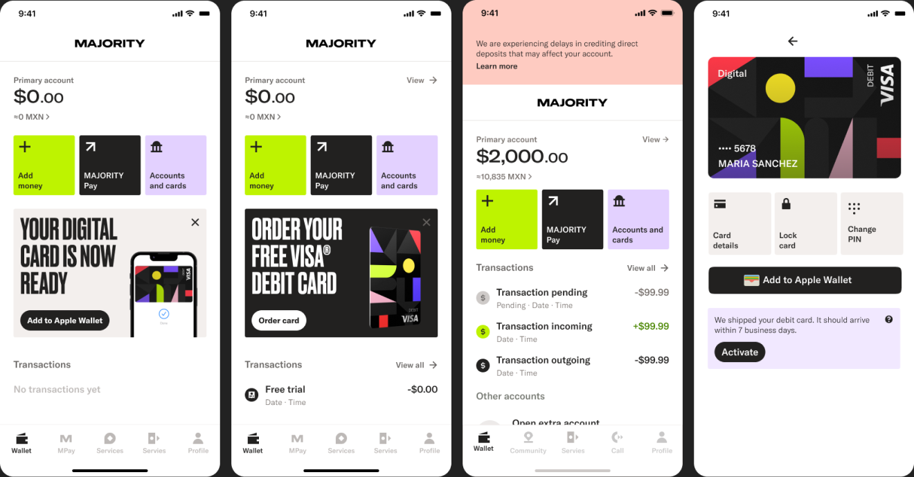
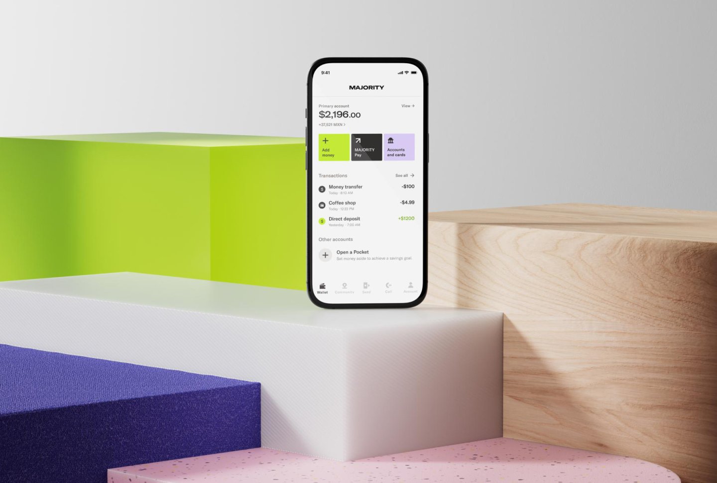
The existing wallet was built as an MVP, functional, but not built to grow. I did a full visual redesign alongside a UX designer, rebuilding the wallet experience on the existing backend to support new features going forward
What testing told us
Before building, we tested three wallet prototypes in Spanish with 15 people in Miami: members and non-members from Colombia, Venezuela, Nicaragua, Mexico and Cuba.
The structure worked. 73% understood the new wallet within 30 seconds, and 87% wanted only their main account’s transactions in the wallet, with other accounts on their own pages. We kept that model.
Hierarchy was the problem. The balance didn’t read as the most important thing, light grey text looked disabled, and colourful icons pulled attention from it. That led to a black-and-white framework where colour is only used to guide, and a balance that leads the screen.
Words mattered as much as layout. “Move money” and “Transfer” were misread as ways to add money, and half the participants couldn’t move money into a second account. Money in and money out needed clear, separate actions and labels.
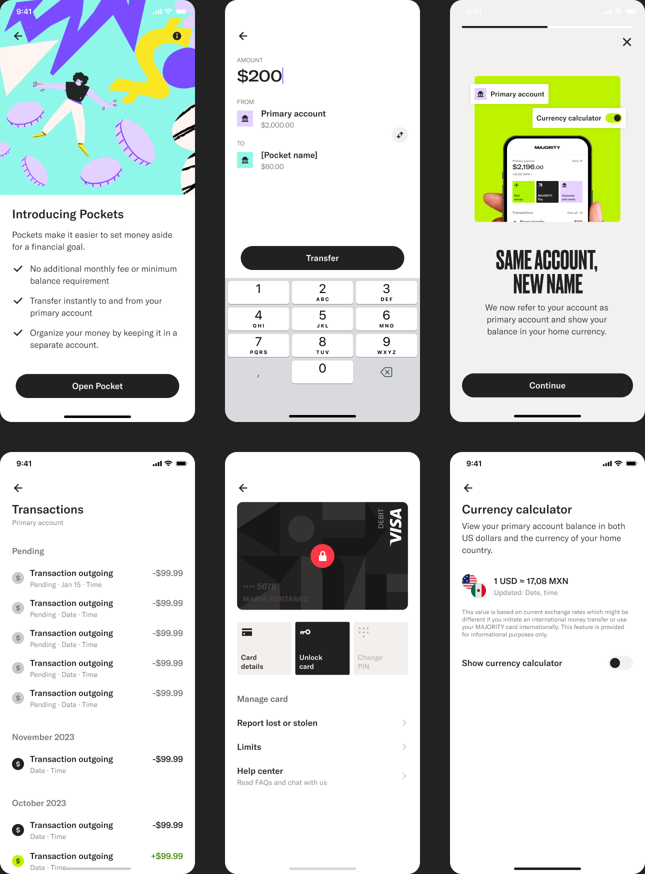
Saving, not a second checking account. People liked the idea of setting money aside each month, but “secondary checking account” didn’t appeal and most wouldn’t pay for a second card. The extra account launched as Pockets: a sub-account for a savings goal, with no extra monthly fee and no card, that only needs a name to open.
Small tools, big trust. Many converted dollars by hand on Google, and everyone wanted to know the exchange rate was up to date, which shaped the currency calculator. Only a third found how to order a card unaided, which is why key actions are surfaced through content cards in the wallet.
What shipped. The new wallet launched in July 2024 with a redesigned wallet tab, accounts and cards, transactions list, ATM map entry and Bill Pay, plus three new features: Pockets, pending transactions and the currency calculator. The structure held as the product grew: a later release let members open up to three Pockets, move money between them and close them, all within the same wallet structure.
Foundational screens
Rethinking the foundation
The existing wallet worked, but it was lean to the point of being limiting. It hadn't been built to hold much beyond the basics, so every new feature meant fighting the structure instead of building on it.
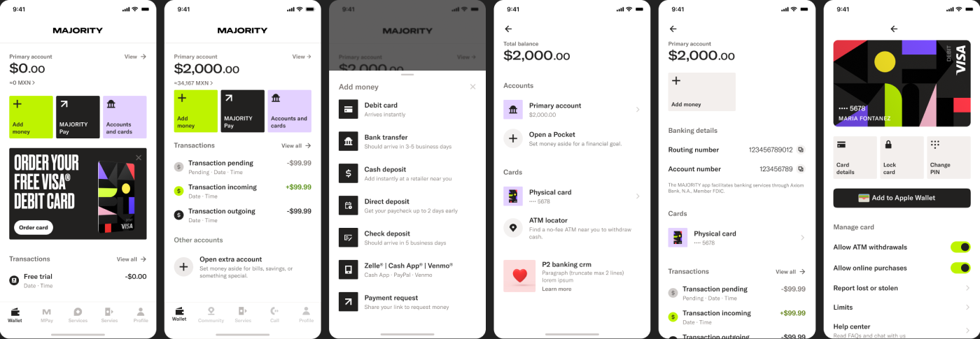
I visually designed the full redesign, collaborating closely with a UX designer on the underlying flows. Together with the Bank team we rebuilt the experience on the existing technical backend, bringing in color, structure, and brand principles that had never really lived in the product before.
The redesign covered the full wallet experience: From the digital wallet itself, add money panel, transaction list, accounts and cards, primary account, digital card experience, content card redesign, currency calculator, pocket accounts (savings), to internal transfers.
Key challenges:
- → Identify needs of existing and future users
- → Impact of new functionalities
- → Future proof information architecture
- → New look vs design debts
- → Design system needed evolving
- → Timeline and stakeholders
Selected screens
Design principles
for the new wallet
- Simplicity
- Our product is complex, but we want to keep the overall experience simple to use, so we favor simplicity over offering too many choices that will overwhelm our users. This includes number of buttons, copy, and amount of content.
- B/W + Functional use of color
- We keep our framework black and white, but use color to highlight and guide users to important information.
- Clustering content with white space
- To make clear groupings of content, we use white space to separate and let features breathe.
- Using icons to guide
- Incorporating icons into a design enhances visual communication and user experience.
- Branded vs functional experience
- The wallet is the app’s start screen, making it important to balance representing the MAJORITY brand and presenting our features.
Content cards, A system that scales
One part of the project was designing, aligning, and categorizing all content cards. This went beyond the wallet itself and touched the entire app, making sure the new content cards would work consistently everywhere, both for in-app communication and for marketing through Braze.