
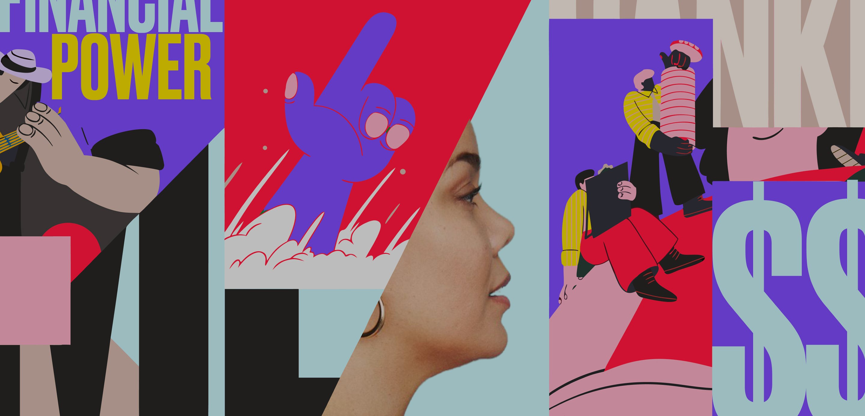
Tiers: a membership with no wrong answer
2026
MAJORITY had a single paid membership, and the price stopped people at sign-up. I designed Tiers, a new pay-per-service Base membership next to Plus, from the onboarding paywall to upgrades inside the app.
Product designer, working with product, growth, content, engineering and legal. iOS and Android, US.
Onboarding
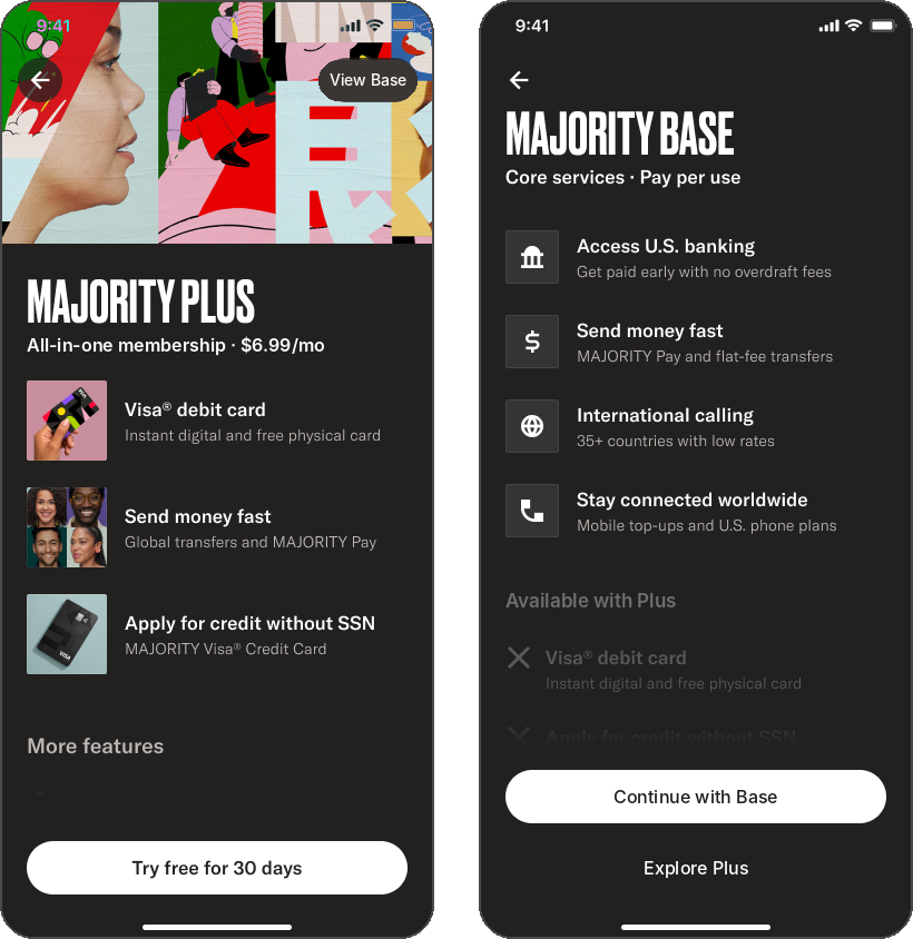
Phase 1: A real choice at sign-up
The challenge: offer a real choice, make Base feel complete, and keep Plus easy to reach later without nagging.
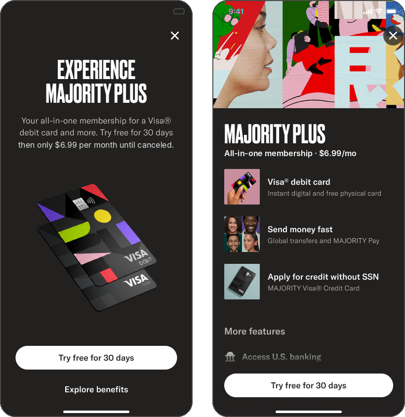
The paywall opens on Plus, with a way to view Base at the top. Plus leads with three hero benefits in imagery, then the full feature list and a single trial CTA.
Base is a legitimate core, not a lesser plan. It lists what's included first, framed as pay per service, and shows what Plus adds below in a muted style, so the difference is clear without feeling like a penalty.
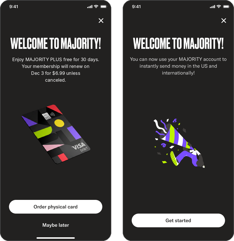
Everyone picks a membership. With two real options, "skip for now" went away, so Settings moved onto the paywall to keep support one tap away. Each choice ends on its own welcome: Plus confirms the trial and goes straight into ordering the card, while Base welcomes members to what they can do now, not what they're missing.
In-app upgrade
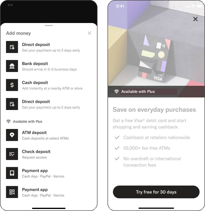
Phase 2: Upgrade at the moment of need
Plus shows up where a feature calls for it. Plus-only options stay visible in context, like ATM and check deposit in Add money, marked "Available with Plus". Feature intros such as Order card keep their own story, with an upgrade CTA instead of a dead end.
One short flow serves the whole app. Every entry point leads to the same upgrade screen, an optional full list of benefits, and a confirmation that returns members to where they started. It adapts: members who've already had a trial see "Upgrade to Plus" instead of "Try free for 30 days". A dark treatment sets the upgrade apart from the everyday app and signals a change of state.
Design principles
Additive, not restrictive Lead with what each membership gives you. Base shows its services as included, never as a list of things withheld. | Membership, not a plan “Become a member” runs across every surface, so choosing a tier reads as joining, not subscribing. |
Context over interruption Upgrade prompts appear where a feature needs Plus, with the value that matters in that moment. | One system, many entry points A single upgrade flow and shared components keep every path consistent and easy to extend. |
Beyond launch
Tiers launched as a staged rollout to new members. I've since designed a single Membership screen that adapts to each tier, the downgrade flow with a pending state members can undo, annual plans with a simple billing picker, the Spanish (Mexico) versions of each flow, and the membership page on the web.