
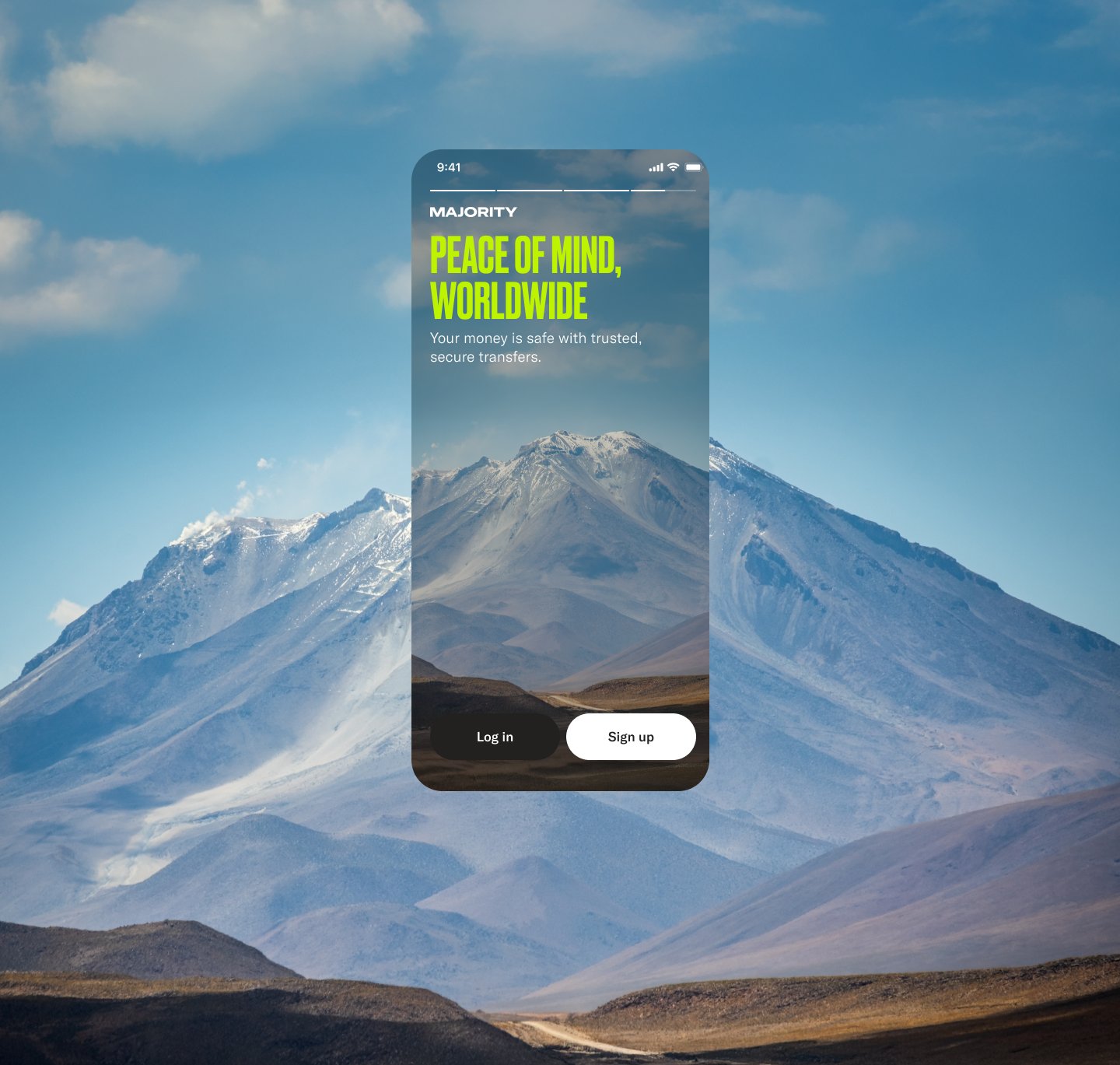
Start screens: Enhancing the brand story
2024–25
I redesigned MAJORITY's start and welcome back screens in close collaboration with product marketing and the growth PM, turning the app's first functional touchpoints into moments where the brand's proposition comes alive.
The problem behind the screens
The redesign had two jobs: fix two costly functional problems, and lean into MAJORITY’s brand story at the moment people first meet us.
Many members sign up with a temporary number when they first arrive in the US. When they later got a permanent number and tried to log in with it, they created a second account without realising. One shared “Get started” entry made that easy. We split log in and sign up, and I designed them as two clear paths, each with its own copy, with errors that point people to the right one instead of leaving them at a red line under a field.
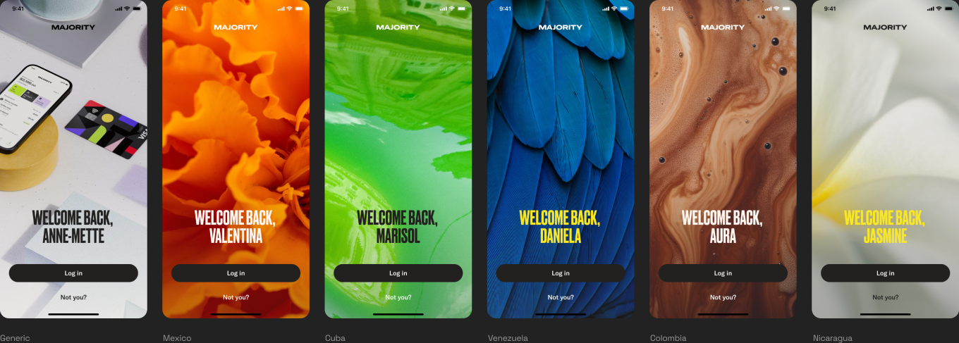
Members also had to re-verify their phone number every time they came back. Now the app remembers them: returning members see a welcome back screen with their name and an image from their own diaspora, and go straight to their passcode. “Not you” lets anyone else start fresh.
Edge cases shaped the logic too. About one in five sign-ups started on the web, so some people already had an account before they opened the app. Instead of making them guess between log in and sign up, we take them back to where they left off.
The brand story was a deliberate choice. Rather than opening with features, the start screens tell who MAJORITY is for, people chasing something bigger, so the brand does the work of earning trust before anyone has to type a phone number.
Messaging and flows ran in parallel: content worked through the proposition while I designed the log in, sign up and welcome back flows, and the visual story was built once the message was agreed.
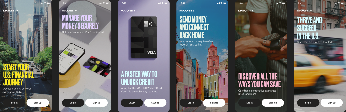
U.S. App:
Chasing something bigger
I redesigned MAJORITY's app start screens, turning functional onboarding into a branded proposition story that tells new users who MAJORITY is before they even create an account. MAJORITY serves migrants and international communities chasing something bigger than a bank account, told through a broad narrative rather than a feature list.
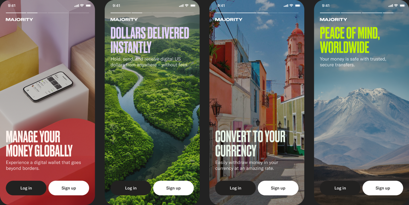
Global app:
The connected landscape
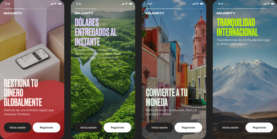
At the launch of the global app, we chose to differentiate it from the domestic product while keeping both clearly part of the same family. I kept the layout consistent with the original start screens so the two felt connected rather than like separate products.
For the visual direction, I moved to nature as a metaphor: imagery that captures money moving fast and freely across borders. Where the domestic screens told a story of arrival and building a life, the global screens told one of motion and connection.
Once the visual concept was set, I used AI tools to speed up asset creation. I generated targeted keywords and location ideas to quickly find brand-aligned photography, then used generative edits to adapt image compositions for mobile screens.
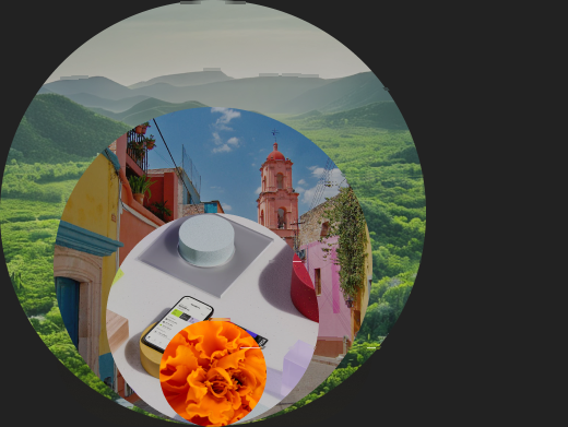
Visual structure
- Local landscapes:
- Sets geographic context, grounding the product in real places users recognize
- City environments:
- Brings it closer, showing the everyday backdrop of where users live or send money to
- Product shots:
- The product itself, clean and functional
- Cultural close-ups:
- Capturing details and moments that feel specific rather than generic
Localization
Spanish localization was part of the design process from the start. We made sure screens were built to hold Spanish copy length and tone, so nothing felt translated after the fact.
U.S. App:
Welcome back!
I also designed welcome back screens for returning users. For our top market, we created unique cultural close-up background visuals, a small nod to our users' culture in a moment that's otherwise easy to overlook.